Bringing card personalization to mobile, where most customers already bank.

Bringing card personalization to mobile, where most customers already bank.

13.5 million customers loved designing their own card, but card personalization was only available on desktop. I led the work to bring it mobile, where 94% customers were active. What we delivered was a cleaner, faster flow where you design your card right on your phone, using a photo you already have in your camera roll.

13.5 million customers loved designing their own card, but card personalization was only available on desktop. I led the work to bring it mobile, where 94% customers were active. What we delivered was a cleaner, faster flow where you design your card right on your phone, using a photo you already have in your camera roll.

My role

My role

Design Lead

Design Lead

Timeline

Timeline

Q1 - Q3 2025

Q1 - Q3 2025

Focus

Focus

Mobilize card personalization

Mobilize card personalization

22%

above the first-month adoption target

22%

above the first-month adoption target

1.3 million

cards personalized on mobile since 10/25

1.3 m

cards personalized on mobile since 10/25

$10.7 m

projected incremental revenue per year

$10.7 m

projected incremental revenue per year

94%

of customers are active on mobile, not desktop

94%

of customers are active on mobile, not desktop

the Problem

A popular feature, stuck on the wrong screen

A popular feature, stuck on the wrong screen

Desktop-only feature

13.5M customers had designed their debit cards on a desktop, despite 94% of customers being active on mobile.

13.5M customers had designed their debit cards on a desktop, despite 94% of customers being active on mobile.

Dated and wordy interface

The existing UI was extremely outdated with old visual design and too many repetitive words that slowed customers down.

The existing UI was extremely outdated with old visual design and too many repetitive words that slowed customers down.

A disjointed vendor handoff

The customization flow was run by a third-party vendor. After handoff, the experience lost the Wells Fargo look and feel.

The customization flow was run by a third-party vendor. After handoff, the experience lost the Wells Fargo look and feel.

The before

Seven desktop screens, 2 brand identities

Seven desktop screens, 2 brand identities

To design a card, you bounced back and forth between Wells Fargo and the vendor across seven outdated and content-heavy desktop screens.

To design a card, you bounced back and forth between Wells Fargo and the vendor across seven outdated and content-heavy desktop screens.

We skipped new research…on purpose.

We skipped new research…on purpose.

The vendor's setup was complicated, and a full research cycle would have pushed us well past the launch window the business needed. We also knew the existing flow already worked well enough for people. So instead of starting discovery from scratch, we leaned on what we already had; a close read on customers' behavior and adoption patterns.


Knowing when not to research is a design call too.

the approach

Four principles that guided every screen

Four principles that guided every screen

Go mobile

Build it mobile-first, right inside the phone app where 94% of people already are.

Keep the handoff seamless

Work closely with the vendor so design and interaction remain one Wells Fargo experience.

Leverage an existing feature

Hook into a new service, like opening a new account or replacing a card, to surface card personalization at the right moment.

Deepen the relationship

Previous research has shown that customers hold multiple cards and reach for the personalized one first. Designing for that preference is what drives the incremental revenue.

the redesign

Design your card in six easy steps, from your camera roll.

A cleaner, modern flow that guides customers fluently: pick a card, choose a photo they already have in their camera roll,

position it, preview, done.

A cleaner, modern flow that guides customers fluently: pick a card, choose a photo they already have, position it, preview, and done.

Pick a card

Start with an eligible card, right in the app.
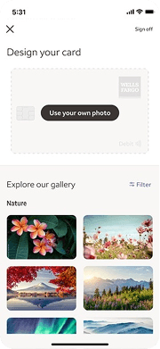
Your photo or ours

Bring your photo or browse ours.

Straight from the roll

Grab a shot from your camera roll.

Line it up

Pinch and drag until it looks just right.

Sneak peek

See the finished card before you commit.

Done

Yay! Your card ships in 5-7 days.

The email alerts got a little love, too.

The email alerts got a little love, too.

Before

Long, repetitive and instructional

After

Warm and to the point with one tap that drops you straight into designing

Exploration

Earlier concepts along the way

Earlier concepts along the way

the Outcomes

Meeting customers where they are & surpassing expectations

Meeting customers where they are & surpassing expectations

By combining customer-centered design with a streamlined end-to-end experience, we transformed a niche service into an engaging self-service capability. The result was adoption that exceeded targets and a simple, intuitive experience that empowered customers to personalize a product they use every day.

For customers opening a new account in a branch, the experience is faster and more seamless. The banker shows an array of pre-customized cards for awareness, and instead of racing to a desktop within 48 hours before the card ships, the customer designs it on the spot from their phone.

22% above target

October goal: 92k customers designing their cards in the first month.

Actual goal: 112k customers designed their cards

1.3 million

cards personalized on mobile since October 2025

$10.7 m

projected incremental revenue per year

48 hrs → 0

New customers now design their card at the branch on their phone at the time of account open, instead of racing to a desktop within 48 hours before the card ships.

Lessons learned

This feature didn't need reinventing, it just needed to move. Most of the win came from simply putting something people loved where they actually spend their time. Closing the visual gap across the vendor hand-off also mattered as much as the flow itself to preserve trust.

This feature didn't need reinventing, it just needed to move. Most of the win came from simply putting something people loved where they actually spend their time. Closing the visual gap across the vendor hand-off also mattered as much as the flow itself to preserve trust.

And it goes without saying that less really is more. Long, repetitive instructions slowed people down instead of helping them. And giving the design a modern, clean look didn't just make it prettier, it made the whole experience feel easier and more inviting to use.

And it goes without saying that less really is more. Long, repetitive instructions slowed people down instead of helping them. And giving the design a modern, clean look didn't just make it prettier, it made the whole experience feel easier and more inviting to use.

Card design studio